Showing posts with label skills development. Show all posts

Saturday, 29 March 2014

Prezi

Before the evaluation questions I hadn't used Prezi. It is hard to use at first but when you get use to all the different tools etc, it becomes easy and allows you to present your coursework in a creative and fun way. 


There are many different tools in Prezi, but here are just a few things you can do:


  • Place arrows, lines and boxes on your Prezi to make it clear and structured. 
  • Add images to your text, so it becomes more visual and enticing.
  • Edit the path of your Prezi, allowing you to put your work in order. 


Wednesday, 26 February 2014

Indesign Help

Today we had a visit from a graphics designer to help us with indesign. 

Here is what I learnt:

  • Image- You can add an image to your indesign by dragging the file onto the page and clicking the location you want it. A blue line will then appear which is the frame of the image, then if you click the circle in the middle a red line will appear, which means you can adjust the image. Another way to do this is to press Shift,Ctrl and Alt which allows you to re-size the image and its frame to the correct proportion without cropping any of it. 
  • Opacity- Right click the image, press effect and then transparency. You can then adjust the level of opacity by typing it. 
  • Text-  You can add text to your page by pressing the T button located on left toolbar then draw your textbox and type. To add random text so you can see what your page will look like, you press Type, then scroll down to the bottom to find the placeholder button.
  • Image in circle- To have an image inside a circle, you firstly draw the circle, which is the ellipse tool on the toolbar and then drag the image file into the circle.You can also move and adjust it like before. 

Sunday, 26 January 2014

Creating my magazine!


I decided to have an image of a brick wall as my background because by having the background plain there looked like something was missing and it made the image look even more photo-shopped than it already does. I then added my masthead design which I had previously created. 


After that I then went on to adding my cover lines and positioning them in suitable places. I found the coverlines a challenge to create because differents fonts and colours had an effect on the clearness of the writing, for example a really light or dark shade of purple does not show up or stand out on the brick wall, neither does a narrow font. I also added a barcode to allow buyers to purchase my magazine.


Friday, 29 November 2013

Pinterest

Today I learnt how to use pinterest for my mood board. Pinterest is an online pin board where people can pin photos on a board, giving them a comment of what you like/dislike or how they inspire you. I signed up for Pinterest, and pressed create a board which then allowed me to start. I had to give my board a title and a short description about what I was planning on doing with it and why I was doing it. After I had done all of this I could then start pinning photos onto my board. Pinterest gave me access to a wide range of photos, I just had to simply select a category. When I found a photo from Pinterest that inspired me, I pressed the red pin button in the corner which pinned it to my board.


Tuesday, 8 October 2013

 
In design!


Contents Page


FLATPLAN!


I have many ideas for my contents page, all in which fit in with my front cover.


As my magazine is about art and music, I'm going to include an image of local band; Killamonjambo. The band is originally from Norwich, which is the reason I want to show them in my magazine. This is because it shows college students to follow their dreams and express their talents, giving them inspiration to do this. The image will medium size with a brief explanation of the band. I took these images myself when I went to see them live at a festival, they were AWESOME!


Over the weekend I done a paint photoshoot with my model, Molly. It was so funny doing this, we literally laughed our heads off. I squirted paint over her, getting her to pose in a certain way which I thought worked best with my front cover and creates a good contents image.
 
Here a some of the photos I took...


I experimented with a range of body shoots, some close ups and mid shoots.
 
During the photoshoot I took some pictures for my front cover. I wasn't as pleased with the turn out compared with my beginning photo, so that's why I'm going to keep it as it is now.


The lighting wasn't that good, which made the image focus less and cause the hair to slightly blend in with the sky. I much preferred the brick wall background on my other photo to this.


Sunday, 29 September 2013

Front Cover

 
This week Im experimenting with photoshop, to create my magazine front cover. As I have never used photoshop before, I will be learning how to use different tools by watching YouTube videos, to help me become an expert. Although Im not actually using this image, I used it for my editing, to help me understand photoshop much better. At a later date, I will eventually use an image of my model covered in paint, and just replace it with my previous image.
 
 
Of all the photos I have taken, this is my favourite and I'm going to use it for my front cover. I love how my model, Molly looks dramatic but happy at the same time because she has her mouth slightly open, giving a tiny smile. This could give of the impression that she enjoys college. I think this could have the potential in selling well, if I ever was to sell it.
 

Photoshop Editing

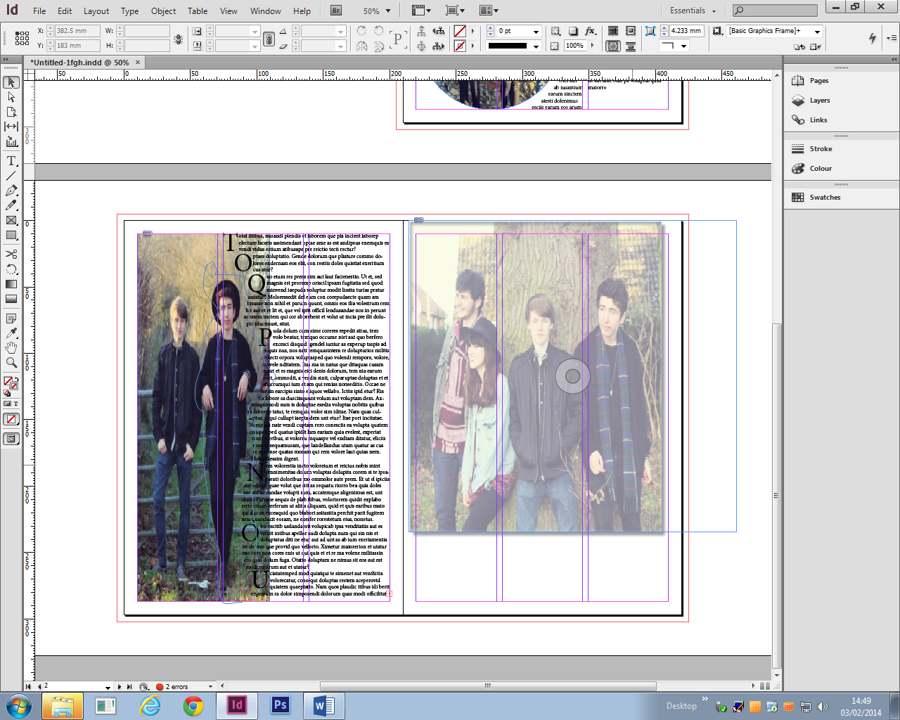
These are screenshots of my magazine cover in progress!
 

Firstly I changed the brightness and contrast of the image, to make the model stand out and grab the attention of readers.
 

I selected a variey of fonts that i liked and then chose my final font from them for my magazine masthead.


 I then added a date to my cover to show my readers when it was produced.
 
 
I changed the date because I decided my front cover looked like it belonged with September as it has autumn colours. I also came up with a cover line which represents my magazine. The reason I decided to use this cover line is because my masthead is 'EXPLODE', so its all about letting yourself be free with art and music. Then I added a barcode even though my magazine is free because its follow the conventions of a magazine.
 
 
After debating whether to put a buzz word on my magazine, I finally decided to involve one in my magazine as most magazines have one.
 
 
I have recently done a photoshoot with paint to update my front cover. Will doing this I decided that I'm going to keep the image as it is, because it turned out better and I prefer the final image. But I will be using my recent images as my content page. I think this works better because when you open my magazine, the model goes from being normal to having paint all over her, making the readers more
 intrigued and giving it more of a meaning.


Here is another photo I took before deciding my front cover image. They were both taken at college, so fit well with a college magazine.
 
 
Above is a image I took before taking the other photos. I thought I would just show you the different positions I got the model to do. This didn't really work as well as the others because my model wasn't looking directly into the camera which creates a different affect on the readers, instead of drawing them in.


Sunday, 8 September 2013

About Me!

You are currently viewing my AS Media Studies blog! On here I will be posting my coursework and latest tasks. Make sure you keep up to date with my blog, so you can read everything you need to know about Media Studies and please keep me posted on your views and opinions about it! Hope you enjoy!!