As my magazine is about art and music, I'm going to include an image of local band; Killamonjambo. The band is originally from Norwich, which is the reason I want to show them in my magazine. This is because it shows college students to follow their dreams and express their talents, giving them inspiration to do this. The image will medium size with a brief explanation of the band. I took these images myself when I went to see them live at a festival, they were AWESOME!
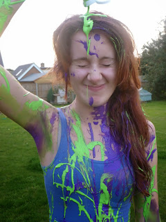
Over the weekend I done a paint photoshoot with my model, Molly. It was so funny doing this, we literally laughed our heads off. I squirted paint over her, getting her to pose in a certain way which I thought worked best with my front cover and creates a good contents image.
Here a some of the photos I took...


I experimented with a range of body shoots, some close ups and mid shoots.
During the photoshoot I took some pictures for my front cover. I wasn't as pleased with the turn out compared with my beginning photo, so that's why I'm going to keep it as it is now.
The lighting wasn't that good, which made the image focus less and cause the hair to slightly blend in with the sky. I much preferred the brick wall background on my other photo to this.


No comments:
Post a Comment