Thursday, 17 October 2013

NME magazine analysis

<
 Contents Page

Buzz
Grabs the attentions of readers who enjoy participating in competitions and to those who like offers.
Flannel Panel
This is an section of the magazine where the contributors to creating the magazine are acknowledge and people get an understanding of their importance.
Header
The font is in sans-serif and is in capital letters to make it bold. Its not the first piece of text which draws you in but I do like the style of it.

Text
The font for 'INSIDE' doesn't correspond to the font for 'NME' on the front cover so look completely different and almost look as if they are from the same magazine. The content article aren't the first feature that catch your eye, which means its not as easy for readers to quickly identify page numbers for the articles. There is a lot of text on the contents page which could be quite overwhelming for readers and lose their attention.
Image
Even though there are a few images on the page, they aren't very noticeable because of the small sizing and are hard to identify what the image is about.
Colour
I think the colours on the contents page a bland and slightly boring compared to the use of many different colours on the front cover but they have still used red as the main colour which links well with the masthead.
Double Page Spread
Image
The stars on this page are all looking in the direction of the camera, which pulls the  readers into the magazine. Each star has a different facial expression, one looks like they are shocked or maybe slightly happy and the other two look the opposite and seem as if they are trying to be cool. This creates a mysterious look and makes the readers want to read the article to see what it is about. the way that the background of the photo has been blurred and made out of focus, makes the stars stand out more because they are the important part of this page. The colours of their clothes work well together because the colours on the people on the left match the colours on Jake Buggs tracksuit; dark blue and white. This makes Jake Bugg look more important and the main star.
Text 
The text has been kept simple, only using one column and a limited amount of writing. this helps the image become the main focus of the page. The use of yellow for the heading makes it more eye catching and then that's joined by the subheading which is underlined to show its importance. The first letter of the article is massive compared to the rest of the text and is capitalised. This gives the page a focal point and automatically brings your eye to start reading the text.
Colour
There are many different colours on this page, which fits in well with the random selection of colours on the front colour and contents page. They have used other colours for the double page spread like the contents page and front cover also have individual colours which makes them have their own meaning.


Uncut magazine analysis

Front Cover


Contents Page
 

Text
 
There isn't a clear header to identify what the page is, which makes it hard to understand. This doesn't follow the conventions of a magazine as you usually find a large header on the page. The content articles are in a large font so you can see the artists names and it helps them stand out.  The size of the font overall is quite small, which for some people could be hard to read and it makes the page look very busy. Also there is a large space full of text about the contributors to the creation of the magazine which adds a different affect because it looks a bit overwhelming.
 
Header
 
A header doesn't really exist on the contents page because it is very small and positioned in the corner. It doesn't use any similar features to the mast head on the front cover which makes it seem as they are not from the same magazine. Its also not in serif font like the masthead on the front cover so doesn't follow any conventions. 
 
Images
 
There aren't many images on the magazines contents page apart from two close up images of the producers. They are very small and in black and white, which doesn't add colour to the page, making it stand out less.
 
Colour
 
The colours follow the normal colour palette of a rock magazine; white, red and black. As the article titles are in red, they are clear to readers, but the page numbers aren't, so blend in with the colour of the descriptions and stand out less.
 
Layout
 
The layout is simple because the articles are all on the same side. I don't really like the layout of Uncut's contents page because there aren't many images, which is one of the first things I look for in a magazine and its also got a lot of writing making it boring.


Double Page Spread

Image
The image takes up most of the double page spread and is very large to show its importance. Also it makes the page more eye catching and draw you in. The image is in black and white which creates a different effect than a coloured image does. It also helps the text and the text colour to stand out more. They both compliment each other well and go together. It doesnt follow the conventions of a magzine because the image covers 3/4 of the page.

Text
There is a limited amount of text which may appeal to some readers who aren't the reading sort and it is also less overwhelming. The heading in very bold and in capitals to add to the boldness. Underneath is the subheading, giving readers some information before actually reading the article. This is also in red which makes it stand out and it fits in well with the other heading on the top left hand corner, which is red too. The first letter of the writing is capitalised, red and large. This makes a focal point for the start of your reading and carries on with the red from the subheading.

Colour
Black and white shows the traditionalism of the band and how famous they still are. it also shows how ironic the band are.


Primary Research-magazine analysis


Q Magazine

Front Cover


Contents Page

 
Colour
The main colours are red, white and grey which continues on from the front cover, to show that they are from the same magazine. The colour scheme clearly shows that the magazine belongs in the music genre because red and black are usually associated with indie and rock. The page numbers are clear and easily noticeable because they are in the same colour as the word 'CONENTS'.

Text
Large text is used for the titles to highlight the artists clearly and are put in bold to show their significance in the magazine. This is also helped by making the titles red. The descriptions underneath the titles give readers extra information and an idea of what the magazine has to offer inside. Its in a small serif font, adding class to the magazine.

Layout
The contents list is aligned to the bottom half of the page in three small columns, which makes it clearer for the target audience.  

Image
The main image doesn't follow the conventions of a magazine because the lead singer from the arctic monkeys isn't looking directly in the camera. However the smaller images located underneath the main image show the band doing this. The main image takes up two columns so readers assume that they are the artists being interviewed. The small images are full body shots to show the way the band members are standing. this also makes the main image striking because head shots are more powerful.


Double Page Spread

Image
The main image is fairly large and has a lot of colours. I like the way the dancers are in a red colour and blend in with the background. This makes Lady Gaga the main focus of the image. The image is followed by a smaller image of Lady Gaga by herself. The position that she is in shows us how much of a star she is and her power in the music industry. 

Text
The fact that Lady Gaga is so well known, you dont need to have a bold striking headline to identify her as you already know by the image. Lady Gaga is written in capitals but is highlighted so people who dont know her by the image, have a clear understanding. The 'I' at the begining of the text is bold to highlight where to start reading. It is also in a similar style as the 'Q' logo becasue its in the centre of a square, with the same colour scheme. They have followed the conventions of a m,agazine becasue the magazine is layed out in three coloums, which is clear and keeps the page organised. The writing in the article is small which you also usually see in a magazine.    

Colour
The colours follow the housestyle conventions becasue they have used red and white as the the main colours. This links the double page spread with the front cover and makes it part of the magazine. The backing dancers in the image have a pink light over them and if you mix white and red together it makes pink. This matches in with the rest of the colour scheme.

Wednesday, 9 October 2013

Contents page evaluation


How does your media product represent particular social groups?

My contents page is similar in the way it reperesnts the social group to my front cover. I have used the same model to feature on my contents page, so it still creates the same effect. I took the photo in a more natural positon, this makes it look like she is singing into the paint, which represents both music and art students.
 

How did you attract/address your audience?

From the research I carried out i found out that most readers like to see lots of images in a magazine. I decided to add an extra two images to my contents page to attract readers.One of the images will hopefully attract music students inparticular. I kept the layout quite simple as sometimes people are drawn away by lots of writing.


Front cover evaluation


The model on my front cover is currently a college student. This represents the particular social group I’m focusing on, which is art and music students. The model which has featured in my magazine fits in my social group because she is studying A level art and plays a lot of music. My mast head also represents the social group because ‘EXPLODE’ means exploding with colour and creativity, such as within art and music.


How did you attract/address your audience?

When I collected my questionnaire results I found out that colour is the main element that attracts people to a magazine. In the process of producing my magazine I tried to add as much colour to the front cover as possible, but this was hard because my image wasn’t that colourful. So instead I made my masthead bold, in a large block font.
 

Tuesday, 8 October 2013

 
In design!


Contents Page


FLATPLAN!


I have many ideas for my contents page, all in which fit in with my front cover.


As my magazine is about art and music, I'm going to include an image of local band; Killamonjambo. The band is originally from Norwich, which is the reason I want to show them in my magazine. This is because it shows college students to follow their dreams and express their talents, giving them inspiration to do this. The image will medium size with a brief explanation of the band. I took these images myself when I went to see them live at a festival, they were AWESOME!


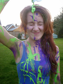
Over the weekend I done a paint photoshoot with my model, Molly. It was so funny doing this, we literally laughed our heads off. I squirted paint over her, getting her to pose in a certain way which I thought worked best with my front cover and creates a good contents image.
 
Here a some of the photos I took...


I experimented with a range of body shoots, some close ups and mid shoots.
 
During the photoshoot I took some pictures for my front cover. I wasn't as pleased with the turn out compared with my beginning photo, so that's why I'm going to keep it as it is now.


The lighting wasn't that good, which made the image focus less and cause the hair to slightly blend in with the sky. I much preferred the brick wall background on my other photo to this.


Thursday, 3 October 2013

Front cover


Finished Front Cover!


Finished Contents Page!