Wednesday, 2 April 2014
Monday, 31 March 2014
Evaluation- What have you learnt technologies from the process of constructing this product?
What I learnt/tools I used:
- I adjusted the hue/ saturation of my images which changed the colour.
- I created/ duplicated layers to build up an image.
- The magnetic lasso tool allowed me to cut around my image which i used in the first draft of my front cover.
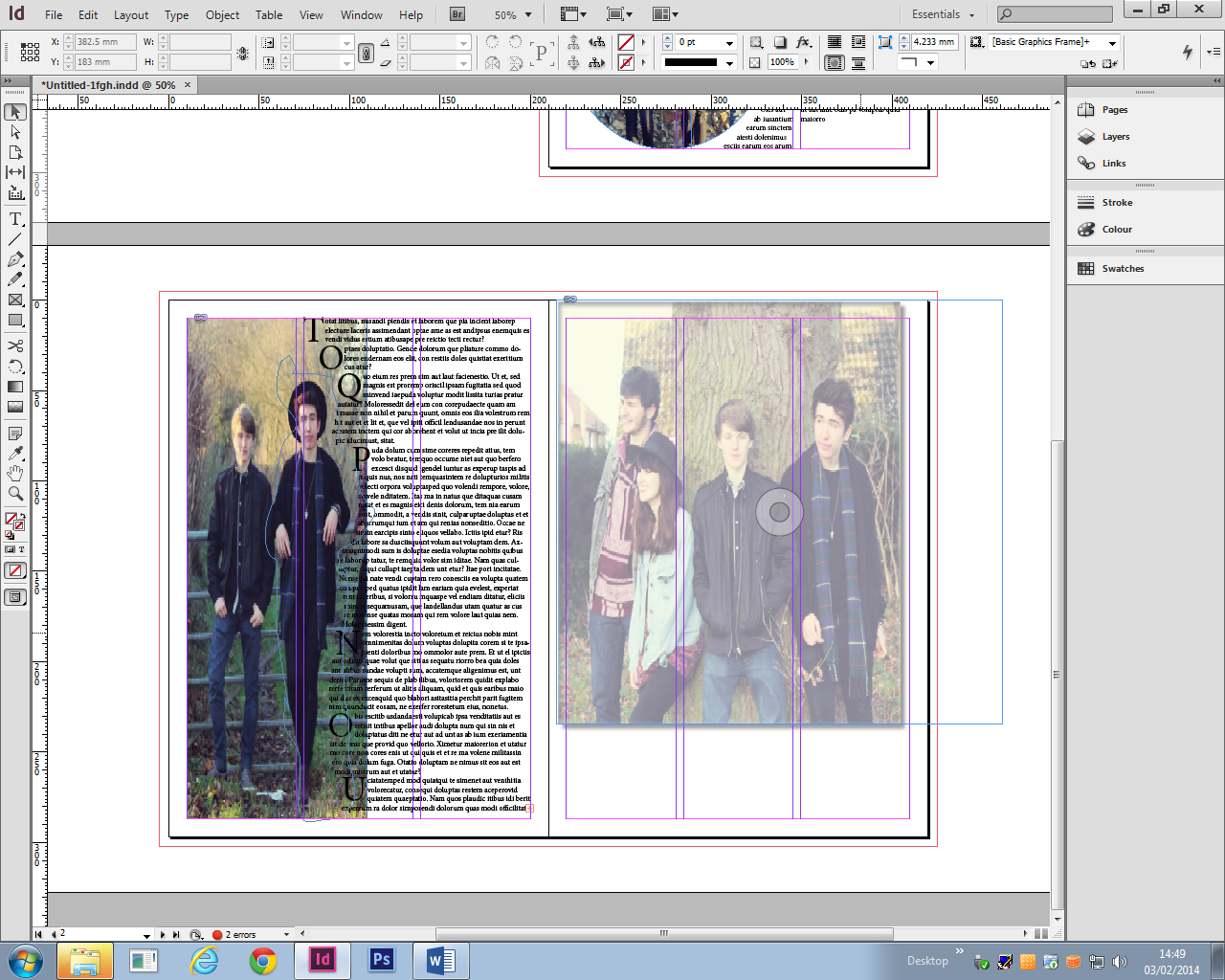
 Indesign- Contents/ double page spread
 What I learnt/tools I used:
- I used the type tool to create my cover lines, article titles and their numbers, and the main text on my dps.
- I changed the opacity of one of my images on the contents page, so I could have it as the background. But I didn't use this for my final draft.
- By using text wrap I could have my interview around my pull quotes without interfering.
Saturday, 29 March 2014
Prezi
Before the evaluation questions I hadn't used Prezi. It is hard to use at first but when you get use to all the different tools etc, it becomes easy and allows you to present your coursework in a creative and fun way.
There are many different tools in Prezi, but here are just a few things you can do:
- Place arrows, lines and boxes on your Prezi to make it clear and structured.
- Add images to your text, so it becomes more visual and enticing.
- Edit the path of your Prezi, allowing you to put your work in order.
Friday, 28 March 2014
Tuesday, 25 March 2014
Monday, 24 March 2014
Sunday, 23 March 2014
I was inspired by this magazines contents page for my design. This contents page is very spacious and easy to read. The page numbers are bold and stand out, including the ones on the images which means the audience can quickly identify the page numbers for the articles. I like how the page isn't over powered with text, so the readers don't become overwhelmed and lose interested; it makes you want to read the magazine to find out about them.
Thursday, 20 March 2014
Construction- Final draft
I changed the colour of 'The Dilemma' and 'Indiego Interviews', to make them clearer and stand out against the cover image. I only just realised that there was a typo error within my cover line ' The Killers' on my other drafts, so I corrected it.
I took in consideration the comments and feedback I got from the focus group and applied them to my magazine. This involved changing the colour, so my house style carrys through.
Wednesday, 19 March 2014
Focus Group
Last Friday I held a focus group with people from college to get feedback on my front cover and contents page. I found this really helpful as they pointed out some good points, so I'm going to make these adjustments to my magazine design and hopefully they will improve it.
Friday, 14 March 2014
Construction- Contents page
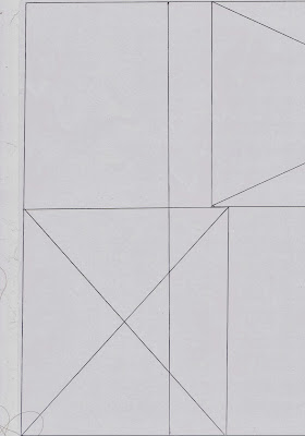
My contents page doesn't refer back to my original flat plan because I felt that there was not enough space for text and i think that the arrangement generally doesn't work, its just not what i want. But I'm glad I didnt follow my flat plan because I'm happy with this turn out and i believe it fits in well with my indie rock theme.
Thursday, 13 March 2014
Construction- Third draft
From the beginning i have found my cover lines difficult to create because of the multiple colours in the cover image. I felt that the black writing I previously had didn't stand out and wasn't that clear, so to resolve this problem I changed all the cover lines to white; as white was one of the few colours that stood out. To emphasize some of the words I changed them from white to red, using the shade of red from the models top. I had to flip my image because the white writing on the models top blended in with the white cover lines. Cover lines need to be one of the main features on a magazine and draw readers in; I felt that the original arrangement of the image didn't allow this. I did try keeping the image the same and placing the cover lines on the right, breaking the conventions of a magazine, but there wasn't enough space as the front model is much smaller and I would then be intruding with the face. I also changed the positioning of the date/price to make it look like its part of the cover image, however I may need to change it slightly as it looks on the wonk. Lastly I just played around with the colouring of the skyline, using a shade which is similar and goes with the denim jacket.
Thursday, 6 March 2014
Hot Desking
In class we done a process called hot desking which invloves going around the room, looking at people's front covers and contents pages, then answering questions about them. We done this to get feedback from others and help us with our designs. Also because the people we asked our media studies students, we can get detailed feedback as they know the terminology and little details other people wont know.
I didnt find this very helpful because the critisim was based on an unfinished contents and front cover. But I have taken inconsideration some of the points they have made and I will make the changes to my magazine. I'm happy that they think my magazine design fits in with my theme because thats the most important part.
I didnt find this very helpful because the critisim was based on an unfinished contents and front cover. But I have taken inconsideration some of the points they have made and I will make the changes to my magazine. I'm happy that they think my magazine design fits in with my theme because thats the most important part.
Wednesday, 5 March 2014
Construction- Second draft of Front cover
I made some changes to my original front cover. I used a new image from my latest photo shoot which I think works better than my original image. I'm still struggling with my cover lines, but this time its finding a colour for them that doesn't blend in with the variety of colours of the background.I'm going to try and change the font and colour again to see if that makes a difference.
Construction- First draft of Front cover
Here is the first draft of my front cover. I found it difficult to create the cover with this image because of the quality. Overall I'm not happy with the turn out because I don't like how photo shopped the image looks. I think that the arrangement of the cover lines don't work very well due to the image. The cover lines are spaced out because they can not be placed over the models face. I don't think that this composition for my front cover will attract my audience because the colours for my cover lines aren't bold and eye catching. As I'm the same age as my target audience and my magazine doesn't appeal to me, I don't think that my target audience will like it either.I'm going to make some adjustments to my front cover so it appeals to my target audience.
Wednesday, 26 February 2014
Indesign Help
Today we had a visit from a graphics designer to help us with indesign.
- Image- You can add an image to your indesign by dragging the file onto the page and clicking the location you want it. A blue line will then appear which is the frame of the image, then if you click the circle in the middle a red line will appear, which means you can adjust the image. Another way to do this is to press Shift,Ctrl and Alt which allows you to re-size the image and its frame to the correct proportion without cropping any of it.
- Opacity- Right click the image, press effect and then transparency. You can then adjust the level of opacity by typing it.
- Text- You can add text to your page by pressing the T button located on left toolbar then draw your textbox and type. To add random text so you can see what your page will look like, you press Type, then scroll down to the bottom to find the placeholder button.
- Image in circle- To have an image inside a circle, you firstly draw the circle, which is the ellipse tool on the toolbar and then drag the image file into the circle.You can also move and adjust it like before.

Friday, 21 February 2014
Photo Shoot number 2
After evaluating my first draft of my front cover, I identified many elements that need to change. I decided that the easiest way to improve my front cover was to use a completely different image. I meet up with my models again to do a new photo shoot.
Here are the images:

I'm going to use this image for my front cover purely because out of all the images I took, this one works best. I like the way the image focuses more on the lead singer but shows that they are a band. I picked this image due to how the way a front cover layout can be established without intruding the models faces.
This image is one of my favourites because I love how natural it looks.I will probably use this on my contents page as you usely find more natural poses. It will also imply a more informal tone which will remove the barrier between audience and artist.
Monday, 10 February 2014
Monday, 27 January 2014
Critical Evaluation of first draft of front cover
I think overall my front cover works because it represents
the genre clearly through the design. My coverlines are positioned around the band so do not cover their faces, however the purple coverlines are much darker which makes them harder to read. I think I also need to make some changes to the band name as that's dark too because of the purple font colour. The font I have used works well because its clear but I'm not sure if I like it yet. The background is quite dark so I will need to adjust that, along with the image because that is also dark and looks slightly too edited on Photoshop; which has an effect on how may magazine looks. My masthead works well because its bold and eye catching with limited colours so isn't confusing. I think my magazine will attract my target audience because 15- 17 year old tend not to like to read much and my magazine doesn't have much writing.
Sunday, 26 January 2014
Creating my magazine!
I decided to have an image of a brick wall as my background because by having the background plain there looked like something was missing and it made the image look even more photo-shopped than it already does. I then added my masthead design which I had previously created.
After that I then went on to adding my cover lines and positioning them in suitable places. I found the coverlines a challenge to create because differents fonts and colours had an effect on the clearness of the writing, for example a really light or dark shade of purple does not show up or stand out on the brick wall, neither does a narrow font. I also added a barcode to allow buyers to purchase my magazine.
Friday, 10 January 2014
Pre Production Planning- Front cover design
There was a slight problem with my original front cover image because I had taken it landscape instead of portrait. To be able to use this image I edited the image in photoshop. I firstly cut the band members out indivually using the lasso tool and moving them across to a new blank document. I had to rub certain parts out and move them closer together. I decided the white background didn't look right so I used the eye dropper tool on Mollys jeans and found a colour from that. The clone tool came in very handing because there were parts of Ollie's( male on the right) top missing from where I postioned him so I cloned the black to create a new part.
Sunday, 5 January 2014
Pre Production Planning- front cover ideas
I know I definitely want my masthead across the whole of the top as it makes the cover look striking and bold. I also want to follow the conventions of a magazine by having my coverlines on the left. I looked at the arctic monkeys on Q magazine and they have the band name in a large font positioned at the bottom, which I quite like.
Pre Production Planning- photo shoot
I really like this image so I'm definitely going to incorporate it in my magazine but I'm not sure where yet. The reason I like it is because the models look really relaxed and natural. this contrasts with the natural location. I also really like the colours from the background, I think they help make the image look 'indie'.
This is the image I took for my front cover, however there have been some complications with the way I have taken it so I'm going to need to adjust this in photoshop. I think this image will work well as a cover image because the models are all looking in the direction of the camera, which grabs readers attentions. The only down side to this image is how the light reflects on the models body,however I maybe able to resolve this problem in photoshop.
This is my favourite image from the photoshoot, simply because I like how natural they look.
Subscribe to:
Comments (Atom)


